Android Design Guidelines
– Are They Really Being Followed?
✅Android Design Guidelines – Are They Really Being Followed?
📍 A deep dive into Material Design compliance in the real world.
But in the world of Android, that ambassador is usually wearing a Material Design badge.
The question is—how many apps are really honoring it?
🧠 What Are Android Design Guidelines?
Google’s Material Design system—originally launched in 2014 and significantly updated in Material You (Material 3)—provides a unified set of design, interaction, and motion principles. It ensures Android apps feel coherent, accessible, and aesthetically pleasing, regardless of who built them.
The core pillars include:
🎨 Color systems (Dynamic theming, dark/light support)
🧱 Layout & spacing (Grids, padding, typography)
🌀 Motion principles (Natural feedback & transitions)
♿ Accessibility (Font scaling, contrast, semantic structure)
🧭 Navigation & interaction patterns (Bottom nav, FAB, top app bars, gestures)
Material Design isn’t just a style—it’s a design language for user trust.
🧪 The Problem: Fragmentation vs. Foundation
Unlike Apple’s tightly controlled ecosystem, Android is open—a blessing for innovation, a curse for consistency.
While Google promotes its guidelines through Material Design Components (MDC) and Jetpack Compose, real-world apps often deviate due to brand demands, legacy systems, or simply… neglect.
Let’s dive into a few practical case studies.
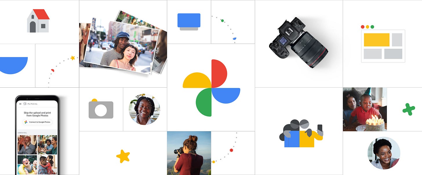
🔍 Case Study 1: Google Photos
📲 Platform: Android 13+
🎯 Verdict: ✅ A Material Design Masterclass
Uses M3 color system with dynamic theming that reflects the system palette
Employs elevation and shadows consistently to indicate hierarchy
Subtle yet effective motion cues enhance transitions without being flashy
FAB, top app bar, and snackbars are implemented exactly as spec'd
Accessibility: Great contrast, screen reader support, and text scaling
🔍 What makes it stand out: Seamlessly adapts across devices—phones, tablets, and foldables—proving that the guidelines scale well.
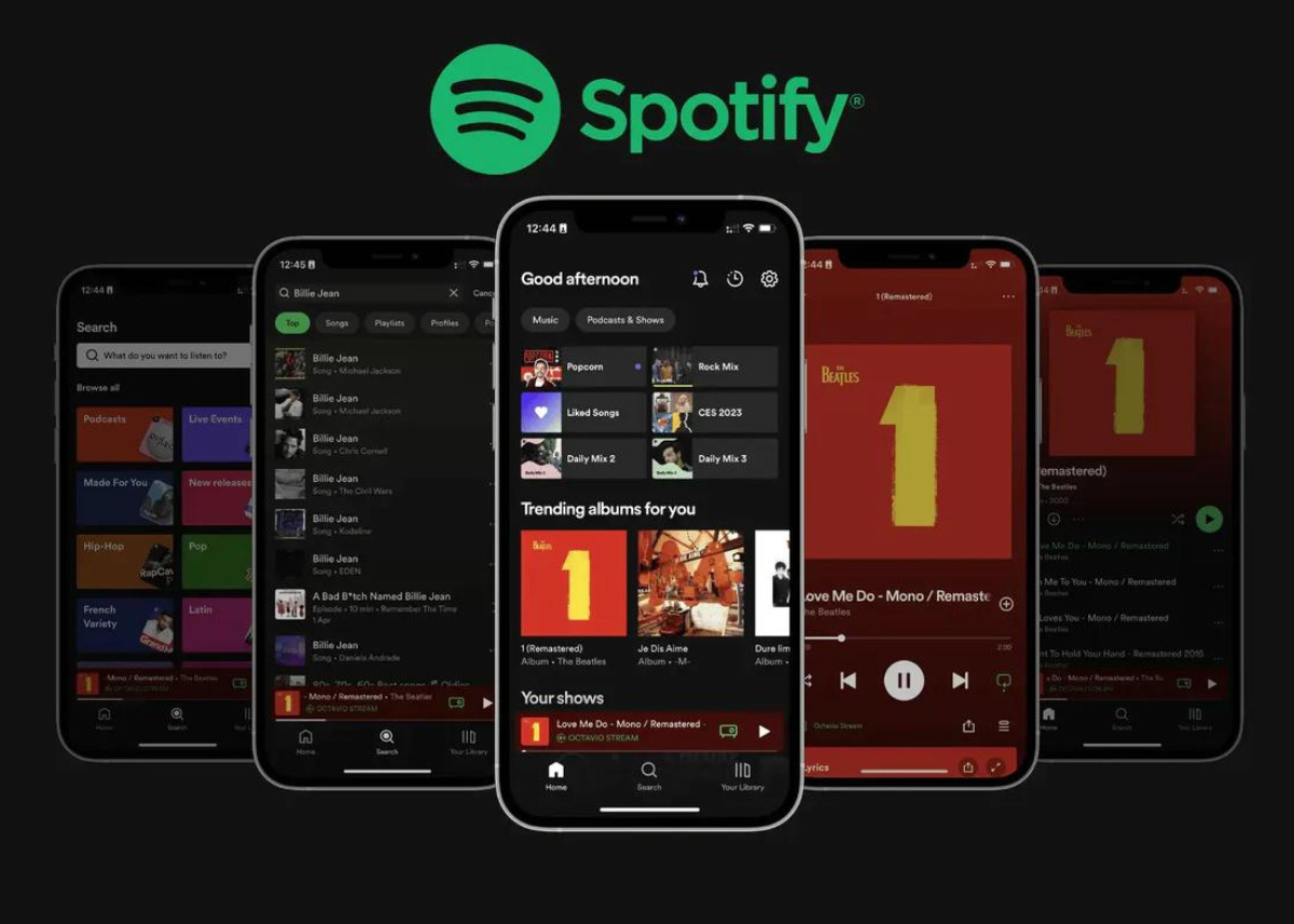
🔍 Case Study 2: Spotify
📲 Platform: Android 13
🎯 Verdict: ⚠️ Partial Implementation
Uses custom UI components with strong brand identity
Navigation bar at the bottom aligns with Material Design, but icons and spacing diverge
Animations are fluid, but not fully aligned with Material’s motion patterns
Color palette ignores dynamic theming, sticking with branded greens and blacks
Accessibility is decent, though lacks system-wide dynamic scaling support
🔍 Takeaway: Spotify prioritizes branding and emotional engagement over strict compliance—successfully, but at the cost of platform consistency.
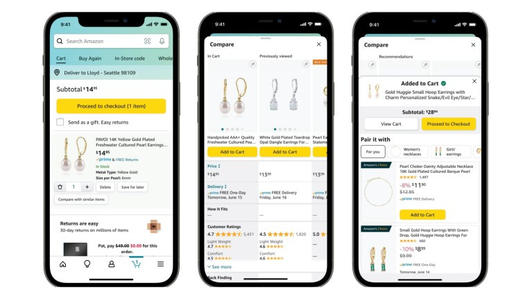
🔍 Case Study 3: Amazon Shopping
📲 Platform: Android 12+
🎯 Verdict: ❌ Rarely Follows Guidelines
Layout is dense, with inconsistent padding and cluttered information
Typography hierarchy is poor, overwhelming the user on most screens
Uses custom buttons, icons, and modals that break expected UX patterns
No Material You integration, poor dark mode support, and limited accessibility features
🔍 Takeaway: Function over form—but the user pays the price with cognitive overload and usability friction.
🧵 Common Areas Where Apps Break the Guidelines
Even well-known apps often fail in areas like:
❌ Weak Spot 🔍 Why It Matters Inconsistent Elevation Confuses user about hierarchy & tappable areas Ignoring Material You Feels out of sync with system theming and OS experience Weak Accessibility Support Fails users with visual/motor impairments Custom Components Everywhere Destroys predictability and familiar UX patterns Poor Motion/Animation Makes apps feel clunky or unresponsive
📘 What Google Suggests (and Enforces)
With Android 14 and Material You, Google is becoming more assertive:
Material Design Components (MDC) are updated regularly for Compose and XML
Jetpack Compose encourages declarative, clean, guideline-friendly UIs
Material 3 UI Kit for Figma provides the design tokens and components
Google Play Store now scores apps on design & accessibility quality
Designing with Material isn’t just good practice—it increasingly impacts visibility and ranking.
🧠 My Reflections as a Designer
In my own design journey, I often wrestle with this:
“How do I balance creative expression with platform standards?”
Here’s what I’ve learned:
When in doubt, start with the guidelines. Material 3 does 80% of the heavy lifting.
Customize selectively—brand voice matters, but user familiarity matters more.
Performance isn't just code speed—perceived speed via design is equally important (Doherty Threshold, anyone?).
If you're building cross-platform (Android, iOS, Web), respecting platform paradigms is non-negotiable.
🔧 Recommendations for Designers and Developers
Audit your existing app. Check spacing, theming, accessibility, and motion.
Use Material Design 3 components. You’ll get consistency, support, and updates.
Test with real users. See where inconsistencies cause confusion or hesitation.
Iterate slowly. Even apps like WhatsApp are adopting Material You gradually.
Use Jetpack Compose. It makes following guidelines almost effortless.
✍️ Final Thoughts
Material Design isn’t a rulebook—it’s a framework to help your app look good, feel right, and work better across Android’s massive device landscape.
The best apps use Material as their foundation, not their ceiling.
If your app feels “off,” your first fix might be just 1dp of padding, a proper shadow, or a better motion transition away.
Let’s build Android apps that feel native, familiar, and delightful—the way they’re meant to be.
💬 Let’s Talk:
Which Android app do you think nails Material Design? Or which one needs a serious UX rethink? Drop it in the comments.
—
Amish Srivastava
UX Designer | Design Systems Advocate | Human-Centered Builder
📬 Let’s connect on LinkedIn
📝 More ideas & deep dives → amishsideaspace.substack.com


